|
Oops-I had a solo exhibition of my imaginary landscape series and never made a blog post about it. Well, you can see the paintings in the Recent Work portfolio section of this site!
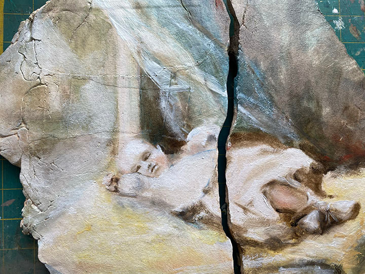
I’ve begun a new series of paintings I’m calling Requiem, based on photographs of deceased people that have had an impact on my life. I really liked the broken, distressed slabs of clay that I used in the Imaginary Landscape series, and leaned into that when making slabs for this new project. I have found deciding on what photo references to use to be way more difficult than I could have imagined, not to mention deciding who to paint. For the first in the series I decided to paint my mother, who died when I was 17 and she was 51. As you can imagine, I have countless photographs I could have worked from, but for some reason I chose literally the very first photo that was ever taken of her, in May of 1927. The photo is of course black and white, and it’s blown out and blurry, but there is something so evocative about the photo I followed my instinct and used it. Here is a work-in-progress shot, sorry it’s on the weird old green cutting mat that’s on my desk. I like the Zoomed in view because you can see how the cracks/texture in the clay work with the painting and there is less of the distracting green mat visible. Of course once it’s finished, I’ll do a better photo of the entire painting.
0 Comments
What I’ve read is that Woad should be planted in March, and harvested at its peak in July. Well, I din’t plant this year until June and July, and didn’t have a chance to harvest until this week, in mid-October. I was able to draw on all my experience. First, I only bothered with the best leaves. The new, not so big and not so small deep green ones. I ignored the temptation of those huge leaves-by the time they get that big, I have discovered through eco-prints (see my Where is the Woad post) that they don’t have enough pigment to bother with them. I didn’t pick that much, because I wanted to try one new thing-a different source of alkali, namely water soaked in the wood ash from the NCC East 40 kiln. I soaked the ash nearly a year ago, and wasn’t sure if it would lose any of its power in that time. There were so few leaves they looked lonely in the bottom of my smallest dye pot. But they yielded enough pigment to show that the leaves have plenty of pigment in them right now-and that I've got my process worked out. Here’s a summary of the process:
Where is the woad pigment in the plant? The pat answer I’ve heard is “in the leaves.” Not always, I just discovered. In one of the Michel Garcia DVD’s I bought, he makes prints from woad by simply mashing the leaves into cloth with a hammer. He then washed the cloth with a neutral dishwashing liquid (Dawn) and the non-permanent green washed out, leaving a print where the blue pigment was visible. I tried it, and realized the implications almost immediately. The pigment isn’t where I thought it was. I had been harvesting the huge outer leaves, with the idea to give the new leaves room to grow. While that pruning approach worked to make the plants grow like weeds, I had a hard time getting pigment. Here’s that first print. You can see, that the blue is NOT in the big leaves or the stems-there are only the faintest traces of blue in the big leaves. In fact, another print made at the same time as this one, was left outside in the sun and rain. The green vanished completely, but the blue stayed. The blue-the desirable pigment we get from woad-is very stable over centuries, as the Unicorn Tapestries etc. clearly show. The other stuff in the woad “goes away” with the action of water and sun-and that is something I was able to put to good use, more on that later. The point is, the light green you see in the photo above is NOT the pigment, and will vanish. The blue is what I’m looking for. And I didn’t find it in the big leaves-it was far more concentrated in the small leaves! I want to do these woad leave prints on a regular basis to track where the pigment is-and when. On February 14 this year (2023) I made another print. I made the print in a slightly different way, so as not to use up so much of the bamboo rayon fabric; instead of folding the fabric in half and the leaves in the middle, I put paper on one side and fabric on the other. I also used a smoother surface underneath them, with the idea of not losing any of the print to the “valleys” of the concrete block I had used for the first print. The cloth side was blurry and harder to see than the paper side, so in the photo below you see the leaves arranged on top, and the print on the paper below. The print wasn’t as good overall as the one from summer, so maybe the rough concrete block was better? Another surprise-the pigment had left the leaves, but was now in the stems! In summer, it was the opposite. Not only that, it was the larger leaves with the thicker stems that had the pigment, not the smaller leaves. So apparently in the colder weather, while the woad does not go brown and dormant or die like most plants here in Pennsylvania over the winter, the pigment in the plant moves around. So if I want to harvest pigment in winter, do what I mistakenly did in summer, and use the larger leaves! Interesting. I had heard that once the plant looks purple, the pigment is destroyed. Yesterday I picked a selection that was purple in various places. Since I was at home and didn’t have a concrete block, I used one of the concrete steps to my house. The result was terrible, sorry, it makes the photo very hard to “read.” But if you look closely enough, there is no real blue, only purple and green, both of which are fugitive. Every source says the purple leaves are ruined for pigment production, and my own test confirms this. My residency at the NCC East 40 began on June 1, so I didn’t get to plant the woad until a few days into June last year. This year I plan to sow in March as is considered optimum. Woad needs wet to germinate, and isn’t much bothered by cold. That’s next month! Now that I have the eco-print test (mashing the plant onto cloth and/or paper) I plan to do it both on the 2023 crop and the 2022 crop, to see how much pigment is where when! This will give me much more specific information than I have been able to find in any source.
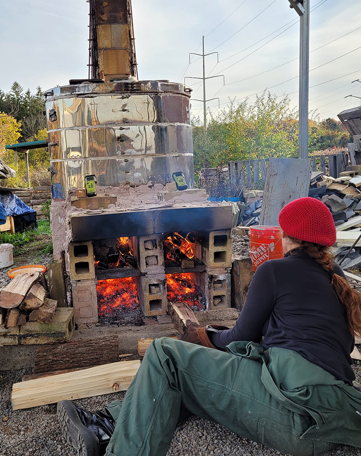
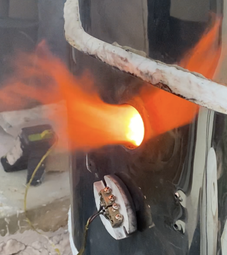
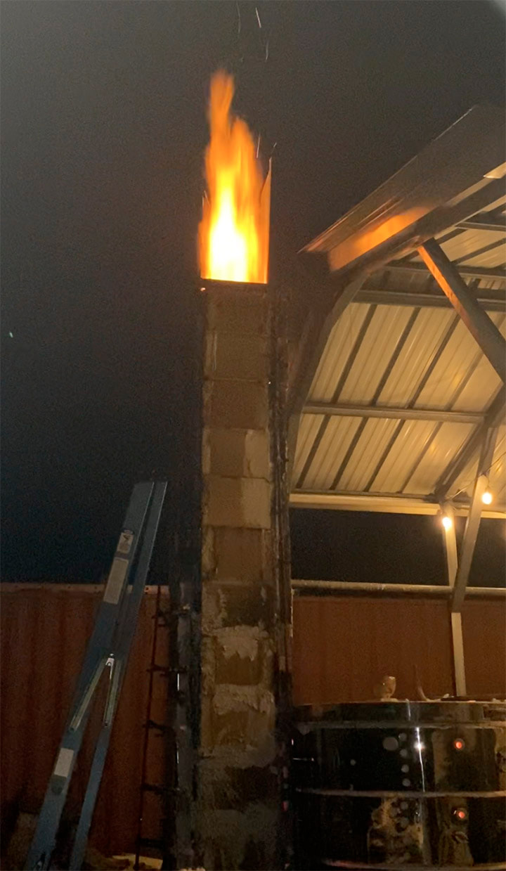
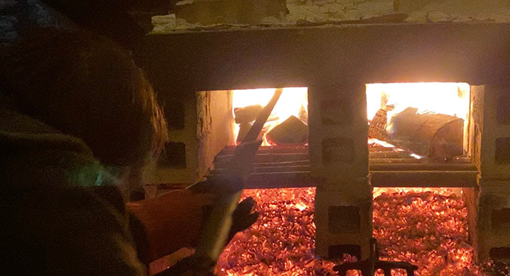
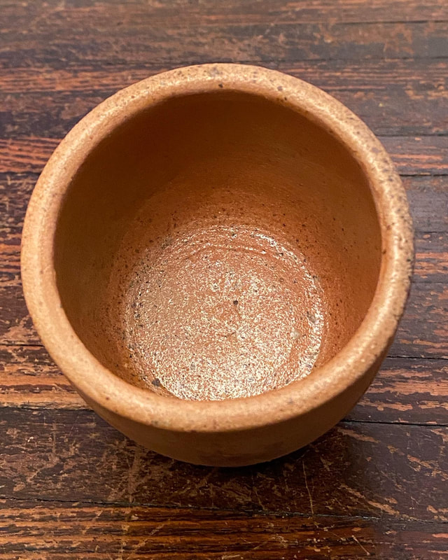
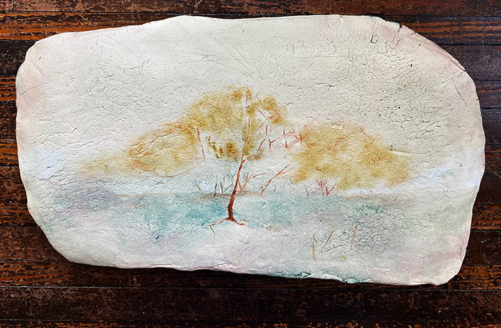
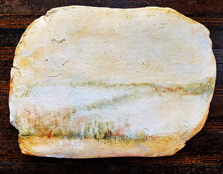
Finally, there was another huge “Aha!” moment that I had inspired from the eco-print process; I can use sunlight as well as water to help get rid of the impurities. Last summer I was processing a large batch of woad leaves that I later learned low pigment content from doing that first eco print. I could tell there was pigment, but there was also a lot of the fugitive yellow that I needed to get out. I did what Garcia showed in his DVD, which is to wash the pigment. You use a fine mesh cloth to catch the pigment, but the fugitive yellow is soluble in water and gets washed through. Every time I rinsed, the pigment got less green looking (from the fugitive yellow) and more blue. But after a half-dozen washings, and all that waiting for the liquid to go through the cloth to the bucket below, I got frankly tired of my kitchen being a mass of buckets and strainers. I dried out the pigment, put it in glass, and put it in the window that gets the most sun. I shake up the little jar periodically, and it continues to improve, at this point I’ve actually used a little in in some paintings. Now that the eco prints are helping me to understand what to harvest when, I won’t have to deal with such an annoying batch again! The hard thing about imaginary landscapes on clay (see my first post on these) is that it’s so difficult to know when they are “done.” The interaction of translucent paint over the texture of the clay slabs can look so good in the early stages that it’s hard to know if any more is needed. I showed two paintings in the ESU Faculty show this fall that were minimally worked, but I’ve decided to add more to both of them because while I liked them from close up, from a distance they weren’t reading very well. And, as I had worked more and more into other paintings while those two were out of the studio in the faculty show, I decided I liked more layering. My fear had been that the more layers of paint, the less the clay would play an integral role in the painting. But after adding a lot of layers on some of the paintings I realized that the “clay-ness” of the pieces was still playing a big role in the work. I need to take more photos, but, here are a few paintings as they are at the moment-the paintings’ progress. I was so busy telling the story of firing the old wood kiln in part 1, I didn't include all the photos I had picked to go along with it! For more information of what these are about, ready part 1 from December 2, 2022. 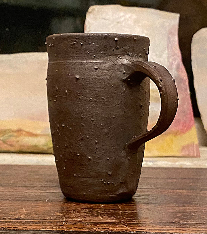 In part 1 this was still wet on the wheel. Here it is fully fired. None of the other pots had protrusions like this one. I think that's because I had put woad inside, and we capped it with aluminum foil so that the woad vapors would stay inside. Something about that made whatever impurities were in the clay kind of pop out. This was the A body garden gold you saw me mixing in part 1 of this post. 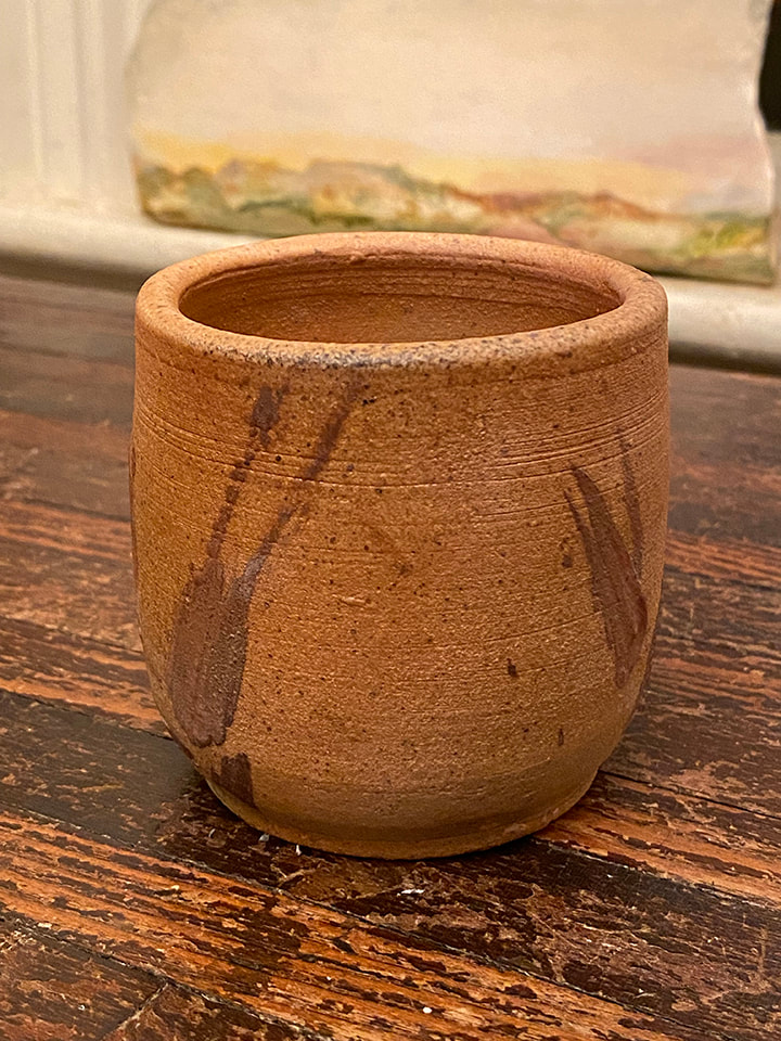 This is the outside view of the cup above. I used 100% garden gold clay (dug from the East 40) using a brush I made from grasses at the East 40 to make the bush marks on the side. This was a commercial 119 clay body. I had made this for a demo before making the A and B body clays from the East 40 "garden gold." Why would anyone want to go to the trouble of firing a wood kiln-the firing can take days of constant attention and fire-stoking when they could just use an electric kiln that you can program to do all the work? Wood kilns are not common, many ceramic students and artists never get the opportunity to find out. In October, I had the amazing opportunity to help fire a wood kiln. I even got the honor of lighting the right side of the kiln. I knew something about the process before I had he actual experience; the fire surrounds the clay and deposits ash on what is being fired, creating serendipitous effects that simply can’t be achieved in any other way. But there is also a community aspect, and yeah, it’s somehow embarrassingly satisfying to play with more than two thousand degrees of fire. Between Covid and a groundhog undermining the kiln, the old woodfire kiln hadn’t been fired in years. Luckily the groundhog had vacated the premises when Andrew Storck and I took on the task of rebuilding the firebox. This is not something I would have attempted on my own, but I was keen to help because that’s the best way to learn about the kiln construction-to literally rip it open and see how it works. Unlike store-bought kilns, wood kilns are built as one-offs, and whoever built it has many choices to make. We had no idea what we were getting into, or how long it would take. Ellie Wirthiem joined in and we got the firebox of the kiln taken apart and put back together again faster than any of us anticipated. It was such a great feeling-glad I took a selfie to capture that burst of joy. However excited we were at getting the old kiln back together again, we had no idea if our modifications would work, or not, or if there were other problems with the kiln from sitting for years unused, so it was decided not to make the changes too permanent and to do a test firing. Another factor was that in the past, that kiln had never been fired hotter than cone 6, which is about 2,200 F. A new wood kiln is under construction that is designed to go hotter, to cone 10 which is 2,385 F. That might not seem like a lot, but once you get to a certain temperature, it’s really a struggle to get a wood kiln hotter. Also, a clay “body” (recipe, if you will) that works at cone 6 could warp or even melt into a puddle on the kiln shelf at cone 10. In fact, testing clay for the cone 10 wood kiln environment was a compelling reason to fire up the old kiln. That way, once the new kiln is completed we have a reliable clay recipe to use in it. Walter Heath, who is the alchemist behind the clay getting mined and processed from the East 40 in the first place, came up with 2 recipes to serve as a starting point for a cone 10 clay body. They both featured what we call the “garden gold,” the local clay mined from the East 40. While I had no previous experience firing a wood kiln, I do have experience mixing clay, so I was happy to take on that task. There are machines specially made to mix clay, which I had used in my undergraduate days when I worked as a paid assistant in the ceramics department, but we don’t have that machinery so I just used a sturdy tub and a powerful drill with an agitator attachment, for want of a better way to describe it. Without the heavy machinery, you can’t mix the clay with only the amount of water needed for the finished clay; you have to add lots of water and so end up with smooth, nicely mixed clay soup. After hydrating for at least a couple of days, the soup (called slip) has to be poured out onto water-absorbing plaster slabs to get it to a workable consistency, so the clay-making is at least a 5 day process.
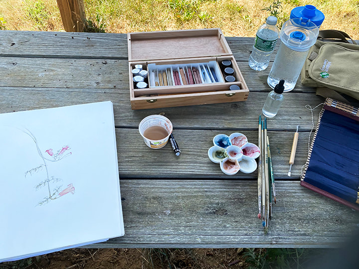
The primitive and labor-intensive processes of growing dye plants, making natural dye, making pigments including from the natural dye, making paints from the pigments and making clay structures to paint them on took up the bulk of this summer’s residency. Now I’m finally using all those materials! Around August first, I started using only oil paint I had made in the residency on the clay slabs, and then tried out the watercolor to tint a pencil drawing I had made of something (I’m not sure what kind of plant it is) growing in the community garden. After only 3 days of painting, it was pretty clear what was missing; a true brighter, lighter yellow and a more opaque white. Throughout history, from cave painting onwards, many artists have done amazing work with very restricted palettes such as brown, black and white. The most restrained color palettes, especially monochrome, nearly always use white. Problem is, modern artist paints generally use metals for white. Historically and to this day lead white was used, now mostly titanium and some zinc are used for white. The processes to make the metal paints are just not something I’m NOT going to get into, because of how involved they are, the equipment needed and how potentially toxic it can be. I first tried chalk from champagne, France-a natural white material I had on hand because it was used in the pastel and gouache paints I made. I quickly learned why chalk is used to make pastel and gouache-it’s almost transparent. If you add chalk to a paint or pastel, it changes the texture and working properties, but what you see is not so much the chalk but whatever the pigment’s color-blue, red, yellow etc. The chalk just wasn’t opaque enough. Making my own set of paints, and using them, has given me an appreciation of what is essential and what isn’t. I'm using far fewer colors, and it's frankly pretty interesting how far these few homemade paints can go. I plan to solve the white dilemma with white clay for white. I know white clay used to be mined from this area, and hopefully I’ll eventually be able to find some local white clay. With the residency over and fall classes almost here, I’m going to cry uncle and “cheat” with some commercially made white until I can make a white from clay. When it comes to the true yellow, I’m confident I can do this myself with natural, local materials. I have some dried weld that Marla grew for me in her dye garden, and weld is one of those dye plants that was historically used to make lake pigments. I’ve made lake pigments before, and I’m hoping to just make do with the garden gold until I can make pigment from the weld. At this point I haven’t cheated and used any commercially made yellow paint. I’m really enjoying exploring the imaginary landscape idea with my homemade natural paints on the clay slabs. I work on a bunch at a time, working on each a little each day, building up the colors. I do of course mix the colors, but I also use layers of translucent paint, where one layer is dry before I add the next layer. The layers are thin so I don’t lose the texture and properties of the clay slabs. The weight of the clay, the physicality is important. They are not images on a “blank” white picture plane. I’m not trying to illustrate a landscape, but to allude to one.
It’s hard to know when these paintings are “done.” I put two in the ESU faculty show that are so minimal that it was hard for me to accept they were finished. The show opens the first day of the semester, August 29, at the Dunning Gallery on NCC’s Monroe campus. There are paintings in progress in my studio that already have much more paint on them than the two in the show, but they are not “done” yet because to me they just aren’t doing everything they need to do as a painting. When a painting gets to a point where it doesn’t need anything-where if you did anything more it would make it worse-it’s done. The art is figuring out when you are at that point! I planted woad the first day of my 2022 summer residency, see the mother woad, and made another post about the woad balls I made, which preserve the leaves for use in later dye pots. Woad also has a long history as a pigment, for example in the Très Riches Heures du Duc de Berry, so I was keen to harvest some of the woad I planted, which is already in peak harvest season. In fact, if you don’t harvest the woad, the leaves underneath don’t get enough light and air and shrivel up and die. Woad likes to get harvested every week or two in peak season, and just grows back vigorously. The extraction process for all indigo-containing plants is similar, so I re-watched a DVD from Michel Garcia where he extracts pigment from fresh Indigo leaves in Mexico. I jotted down the steps in my notebook and headed out to the East 40 where I picked two buckets full of woad. The first step is to pour hot water over the leaves, hot water not more than 120 degrees F. A problem I have with the propane stove, is I can’t effectively keep something at a constant temperature. Hot as it was on Monday, it wasn’t 120 degrees so I knew the pot would cool somewhat, so I started with the water at 120 degrees but then let it soak for 3 hours instead of 2 which would have been enough if I could keep it up to that temperature. The second step after soaking in hot water, is to strain out the leaves; after soaking, all the active ingredient is in the water, but it has to be further processed to bring out the pigment and discard the rest. At this point, the water is green-the blue indigo pigment isn’t formed, it is chemically not indigo yet, but rather the indigo precursor indigotin. Long story short, in the DVD the indigo at this stage was green, but I knew from doing woad dye pots that woad is “sherry colored” (essentially a brownish red) at this point. So far so good. The next step is oxygenating, and bringing the PH up to 9 with Pickling lime. That’s when you should start to see a blue froth, and if you oxygenate long enough, the froth goes away and then you let it settle for a couple hours, and the pigment sinks to the bottom. Or at least that’s how it’s supposed to work. Spoiler alert, spectacular failure is in the title of this blog post. My liquid turned bright orange, no matter how much I oxygenated, and boy did I oxygenate. Zero pigment formed. Undeterred, I went home and bought streaming access to the first Michel Garcia dye workshop-the only one that I didn’t own because I couldn’t buy it as a DVD. In the first workshop, he used woad, not indigo. The steeping time for the leaves in the hot water is 15 minutes for woad, not 2-3 hours. Oops. The next day, August 9. was the last day of my residency, and I went out to the garden and picked more woad. Since I had harvested so much the previous day, and had such a spectacular failure and wasted all of it, I only picked a fraction of the amount from the day before. I took comfort at how fast woad grows, and that I could tinker with smaller batches until I got it right. I did the whole process again, et voila! The water I strained off wasn’t yellow like it was supposed to be, it was bright green. But after the soaking, oxygenating, pickling lime and letting it settle, there was indeed a gorgeous blue pigment! I scraped the pigment onto a sheet of glass so that any remaining water around the solid pigment particles would simply evaporate. The next day I scraped the dried powder off of the glass and put it in a little jar. The powdered pigment will last for literally thousands of years, it does not fade or change, and you can add whatever binder you want to make whatever paint you want. For egg tempera, all you have to do is mix together some of the dried pigment and egg yolk and you’ve got paint, and you make only what you can use that day, so that was the first paint I made with my brand-new woad pigment! I didn’t mind my spectacular failure. The more ways you do something wrong, the more you get to understand what matters and what doesn’t in a process. Before GPS, I would go somewhere according to a set of directions. If there was construction, or I made a wrong turn, I had no idea where I was. Because all I knew was the one way. But the more I got lost, the better I got to know the area. A lot of things are like that. Spectacular failure, or even not-so-spectacular failures, can lead to better understanding, and yes, success.
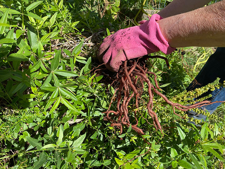
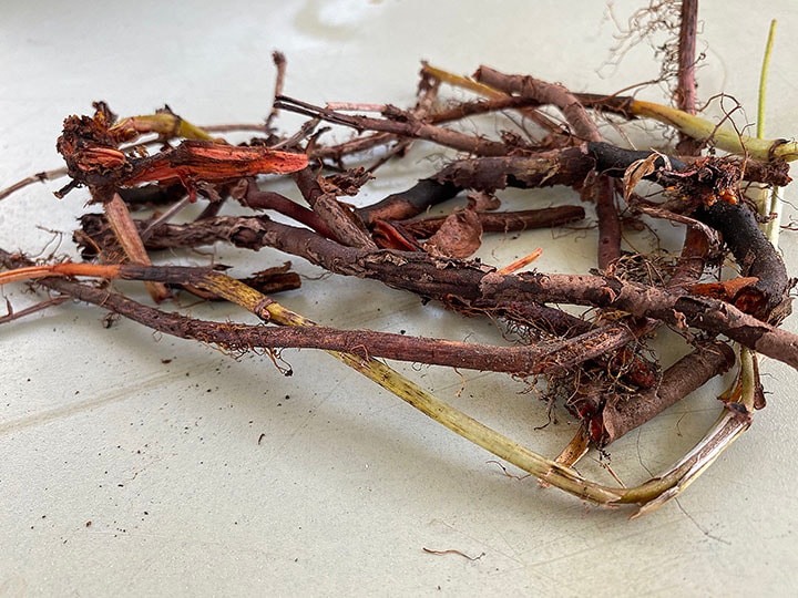
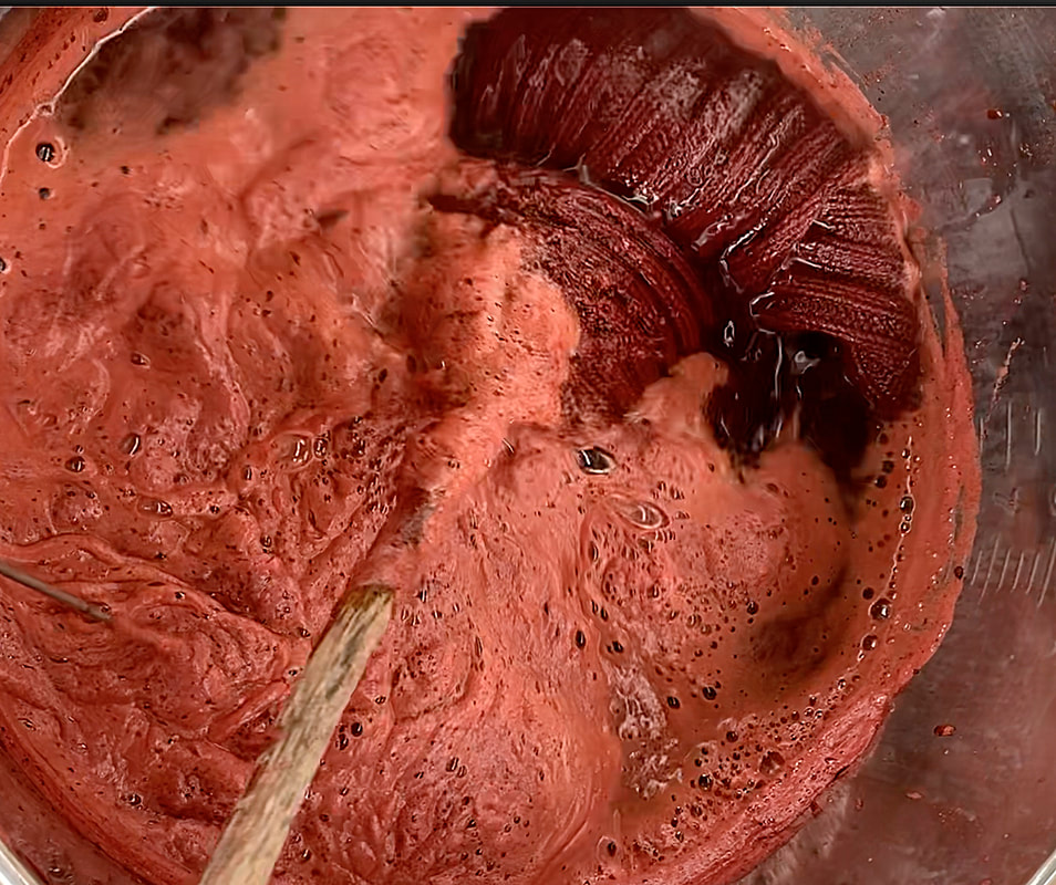
Doing a madder dye pot is something of a long term commitment! There is so much you can get out of it, if you do everything just right. Madder is a plant, the dye color comes from the root, and you can’t harvest the root until the plant is at least 3 years old. The root from the madder plant can make my favorite color in the world-a rich, warm dark red. Madder can also make orange, pink-or brown if the temperature gets too high. The leftovers from the dye bath can be precipitated into a solid pigment (see my 4/29/22 post “Don’t Jump in this Lake”) from which can be made pretty much any kind of paint-oil, watercolor, gouache, pastel, egg tempera etc. The ancient Egyptians used it, the Greeks and Romans used it, it was very popular in the middle ages, Renaissance…and some version of “Madder Lake” or “Rose Madder” has been in my paint box from when I started painting many moons ago until now. All of the above-from antiquity to me-used madder both to dye fiber/fabric and to make paint. You need a lot of madder to get the strong red that’s my favorite color. I’ve had a beige (what was I thinking-me-beige???) sweater, ramie and cotton, for literally decades. One of the reasons I never wear it out is that I don’t wear it much. It fits great. It’s comfortable. But…I’m just not a beige sort of person. I decided that in this dye pot, I would solve two problems; the beige sweater, and getting a rich red on cellulose, which would be for example cotton, linen, hemp bamboo etc., that is vegetable and not an animal fiber like wool. Wool soaks up madder like a sponge, think of the wool Persian carpet reds, they historically used madder for those. But I have repeatedly failed to get a decent red on cotton. I have to admit, if I ever wanted something in pink, the pink from madder is really lovely. But I don’t want pink, I want that deep intense red. So, this time, I pre-treated my sweater and other cellulose fibers with oak galls; anything with a high tannin content would do, but oak galls are as good as it gets with a natural tannin. Black tea has tannin, pomegranate skins have tannin, so does the oak leaves, bark and other parts, but the galls-the tree’s defense agains a wasp-have more concentrated tannin that doesn’t discolor as much, or at least that’s what I’ve read. In fact, when I pre-treated with the oak galls it turned the fabric tan. BUT-I finally got good reds from cellulose! Look at the swatches! I tried several fabrics both with and without the tannin pre-treatment, and the results speak for themselves. And the sweater is now a lovely color-I can’t wait until it’s less than 90 degrees and 100 percent humidity to wear it.  If you look at the swatches A & B also C & D are the same fabric, dyed in the same dye bah for the same time. The difference was B & D got pre-treated with tannin from oak galls. Far let, same fabric as C & D, showing the natural cotton hemp fabric far left, and treated with tannin next to it. K is wool that was in the bath less time than A-D, showing the super deep red. 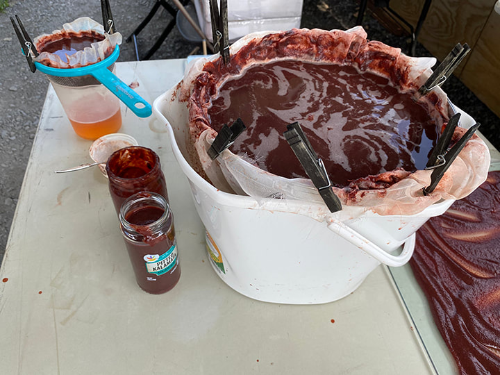 After a chemical reaction to precipitate the dye into a pigment, the hard work is getting rid of the water to make a dried pigment. In the smaller clear container upper left, you can see how the pigment is collecting in the filter, and the clear liquid accumulating below. Same thing is happening in the big bucket, I'm using fabric in a kind of colander as my filter. Far right, you can see the pigment spread out to dry on a pane of glass. See 4/29/22 post for more on this process It’s not unusual to keep a madder dye pot going for a week or more. You bring the temperature up to 150-160 degrees F. for 10 minutes to an hour, then let the fabric sit in the warm pot, day after day, until it gets to the depth of color you want. At a certain point, the fabrics just don’t get darker. At that point, there are choices. You can get lighter colors, you can add something acidic to get orange-or you can make the leftovers into a pigment. I didn’t have things I wanted to dye rose or orange, so I made a lake pigment. I’m very curious to see how the color will compare to the lake pigment I made this past winter.
But wait, this is madder, so that’s not it. I strained the roots out of the dye pot before I made the lake pigment. Today, 11 days after I first began working with those roots, I put them in fresh water and started a new dye pot. Like I said, madder is a long-term commitment. Too long for one blog post, I’ll have to post again to let you know what happened with round two of madder dye pot #8. I keep a “dye-ary” of all my dye pots, and so I know that yes, this is the 8th madder dye pot I’ve done so far. I like considering everything in a painting, every material that goes into it, and this summer's residency gave me an idea. I did extensive work in clay in my first half of undergraduate, and even though that is now ancient history, I still remember enough to take advantage of the ceramic facilities at the NCC East 40. I have to give credit to Joni One-Benintende, a phenomenal ceramic artist, for inspiring me to paint on clay. She does it in a way you see it as a sculpture, and assume the color is the clay or a real glaze, not “just” painted. What I’m doing, coming at this from the perspective of a painter is going to be very different. I had to mention Joni however, because seeing a solo exhibition of her work at East Stroudsburg University’s Gallery about a year ago is what sparked my interest in using clay as a painting ground. I just love the pun-get it-clay as a ground, ha ha! When I used old clothing as a painting support, I didn’t want the fact that it was old clothing to become invisible. I wanted you to see it was old clothing-but only if you looked close enough. Likewise, I don’t want the clay to be some sort of imaginary blank slate. I like to partner with the materials I’m using, not force them to be something else. I want the clay to look like clay, even after it’s painted, I don’t want the clay-ness to be incidental. On the other hand, at least for now, I’m not making sculpture; I do want a “picture plane” of sorts. I could roll out the clay with a rolling pin and trim it to a precise shape, but I’m not. I’m throwing the clay around so it stretches, cracks, and to a certain extent defines its own edge. On the back of the slab I build in some sort of hanging “hardware” that also serves to put the picture plane in front of, not flush with the wall. Or, the table or whatever it’s on-I haven’t ruled out putting the paintings other places than a wall. From what I’ve found, there are plenty of people using acrylic on clay, but for oil, I have to just wing it, I could not find any advice anywhere. I’m not saying no one has done this, I am certain someone must have/be doing it. Knowing what I know about painting technology, I decided that after firing, I would size the clay with rabbit skin glue. Some sort of hide glue, especially rabbit skin glue, is what everybody used historically on any kind of canvass or wooden board before acrylic gesso was invented. I’ve used it on fabric, it’s a great surface to paint on and it’s clear so the clay is still entirely visible. I have some sculptures in my garden that I made around 1979 or 1980, that were only bisque fired. They are getting green from whatever organic thing is clinging onto them, which is really cool since I want them to naturalize into the garden, and never intended to paint them. If these old bisque-fired sculptures can last outside year in year out, I’m figuring bisque is good enough for paintings intended to stay inside, but I do have some that are high-fired. I began “doodling” in egg tempera on the back of one of the fired & rabbit skin glue sized slabs; it takes the paint great. In this shot, you can see the “hanging hardware” in the form of clay strips with built in hoes for wire or string. Sorry I don’t have any finished paintings, so far I’ve been generating the materials to make the paintings, but when I have my first finished painting, I’ll be sure to post it here!
|
Cindy VojnovicArtist & Educator Archives
September 2025
Categories
All
|








 RSS Feed