 When I began working in ceramics all those years ago (the 1970’s!) I can recall being disappointed, first in high school and then in college, at the “lack” of color in the available glazes. We all had our boxes of crayons bursting with color, and even the cheapest mass-produced consumer goods were glaring with color. Even today, consumer goods (even foods) are bursting with artificial color. We inhabit mostly a built environment (how often are you out in nature?) where a cacophony of accidental color prevails. For example, I’m thinking of a very tastefully designed lounge, with all the furnishings and carpets and such color coordinated-inhabited by people sporting all kinds of colors, carrying bags and things with even more crashing colors that were most decidedly not a part of the designer’s scheme. I think we learn to ignore all these clashing colors as some kind of self-defense mechanism. 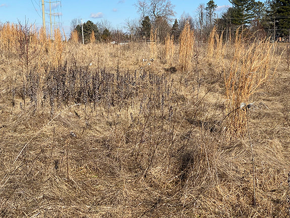 I have to admit, it could be age. But it could also be looking at lots of great pottery-Bernard Leach, Shoji Hamada, Michael Cardew, Phil Rogers, Matthew Blakey and plenty of works by unknown potters in museums-I’m coming to appreciate the palette of winter. It’s like a palette cleanser for the eyes. For me, the browns aren’t neutral. Some are russet, some cool, some tawny, and these browns are punctuated (some days) with blue sky, and evergreens wearing their dark green winter coats. And when it snows, the blue sky is replaced by white, silver and a range of greys as varied as the browns they cover, to varying extents depending on how much it snowed. Don’t get me wrong, I still love the deep saturated colors of medieval stained glass, for example, but I’m also appreciating the subtle symphony of colors that winter offers.
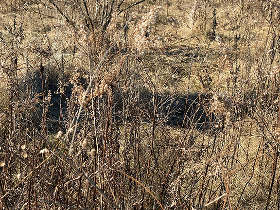
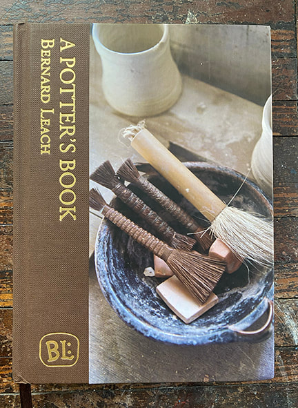
Even as a child I loved drawing bare trees, fascinated by the spooky dark trunks and branches, the more gnarled the better. But the NCC East 40 is mostly meadow. The mountains, ocean and even forest that I always tended to associate with “nature” just are not there. Much like the winter palette of colors, which I’m enjoying more and more, I’ve come to appreciate the subtlety of the forms of the meadow. Today a new revised reprint of Bernard Leach’s classic tome “A Potter’s Book” arrived. This edition has color versions of most of the pottery examples, and they are very much in keeping with the winter landscape. Right now I’m perfectly content to inhabit the colors of winter. 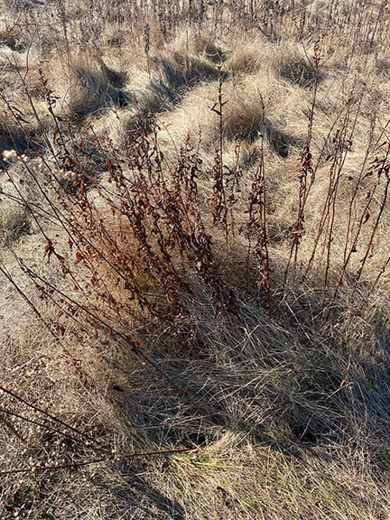
0 Comments
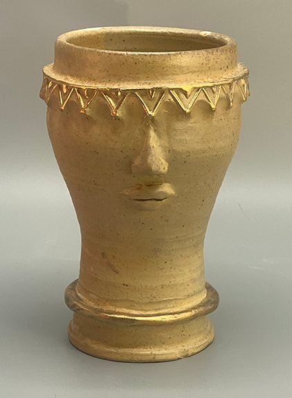
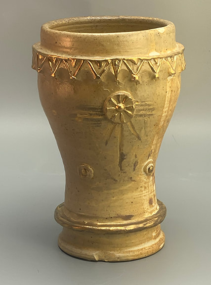
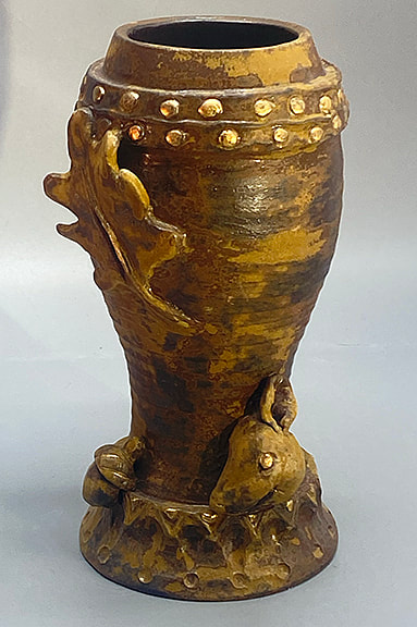
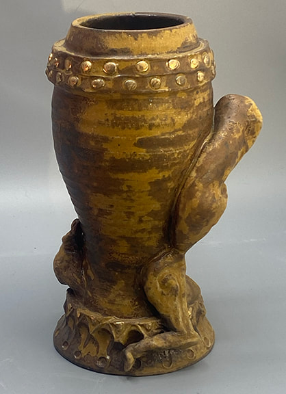
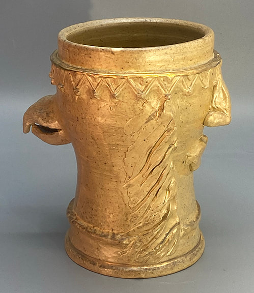
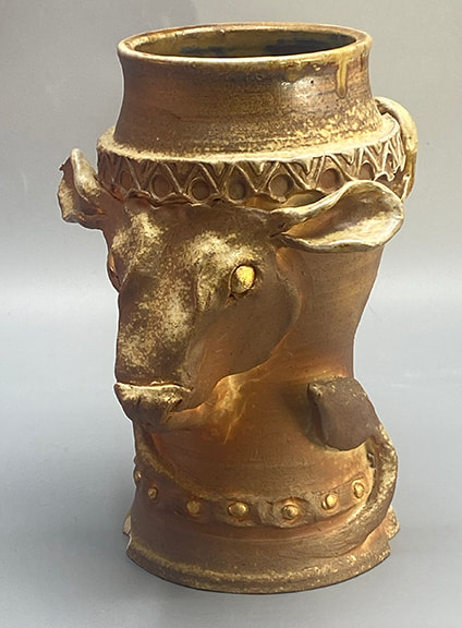
I knew I wanted to use gold on my ceramics before I even knew why! Real gold will evaporate, “volatilize” is the technical term, if exposed to the high temperatures needed to fire the clays that I use. I confirmed this the hard way, three years ago I embedded some tiny bits of gold foil around the rim of a pot, and even in the preliminary “bisque” firing (not as hot as the final glaze firing) the pot emerged from the kiln without a trace of the gold. You’ve probably seen fine china that has gold trim or accents, for example around the edges. The way it’s done, is that you glaze and fire the whole thing first, without the gold, at the usual high temperature. Then, you apply the gold and fire at a much lower temperature to “fix” the gold permanently onto the ceramic. This is what’s called an “overglaze,” and what I finally got around to doing!
With wood firing, you can’t control exactly how anything is going to come out, and honestly the serendipity of it is a huge part of the attraction. But sometimes a piece comes out of the wood firing and, well, needs some help. Well, I had some pieces that just needed a little oomph, a little spark, an accent.Two of them had a lovely, ivory colored satiny glaze surface; but they were to subtle, they needed an accent, some pop. On the other end of the spectrum, I had a piece with a kind of mottled surface, mostly quite dark. Finally, I had a piece that had quite nice “flashing”-effects of the fire on the clay, which highlighted the sculptural form really well-but the surface was quite dull and matte, no shine.
|
Cindy VojnovicArtist & Educator Archives
September 2025
Categories
All
|
 RSS Feed