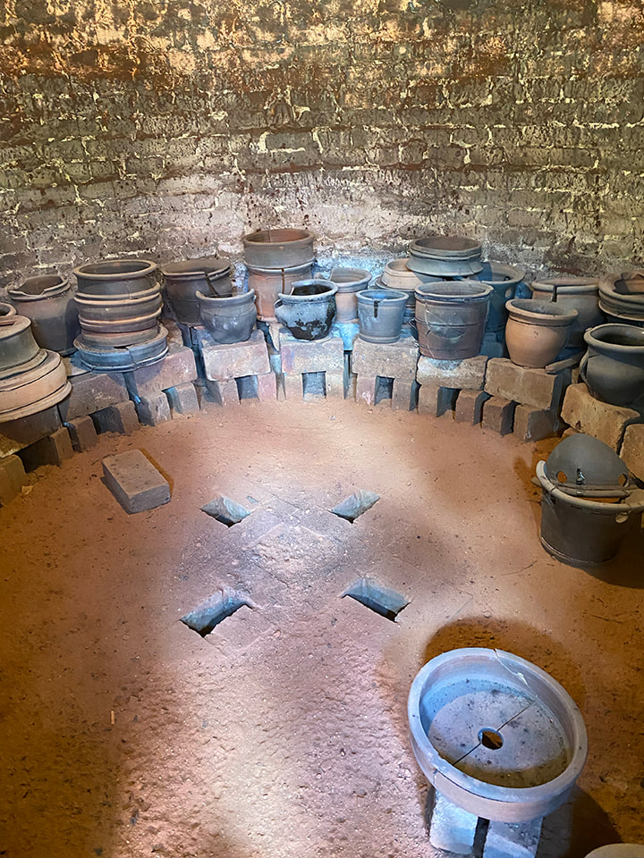
 Interior of the wood kiln at the Stahl's Pottery. You can see where the flame, heat and smoke came up from the 4 fire boxes in the floor; the pottery was put into other plain pots called "saggers" which were stacked floor to ceiling before the kiln was fired. 16 vents in the roof provided a draft to the chimney. I had two main reasons for going to the bi-annual Stahl Potter festival on June 15. One, I found out James Chaney, who I studied with 1978-80, was going to be there and I just had to tell him in person how great his instruction had been, and how I was building on it all these years later. The other of course was to see the historic pottery, and in particular the wood burning kiln. Not long after I met the man who has now been my husband for 25 years, he asked me what kind of architecture I liked best. It’s not a question anyone had asked me before, but my pause was under a minute; Victorian Gothic. What might practitioners of Victorian Gothic such as A. W. Pugin or John Pollard Seddon, for example, possibly have to do with a Pennsylvania Dutch Pottery-or Colonial Revival for that matter? Yes, I know this seems very fractured, but it was the trip to Stahl’s Pottery, and reading the book “Stahl’s Pottery of Powder Valley” that connected the dots. My mother despised all things Victorian and idolized all things colonial, so that adds a family historical twist to this aesthetic conflagration. Let me begin to unpack this aesthetic cacophony. The book has a chapter “Arts and Crafts and the Colonial Revival” and the “Arts and Crafts Movement” was invoked on multiple occasions as I toured the pottery and museum. When I think “Arts and Crafts” I think of 19th century and especially British artists; William Morris and Edward Burne-Jones for example, and if American, maybe Gustav Stickley, not of Colonial American revival. But there are commonalities, and my visit to the Stahl pottery got me thinking about them-and my own heritage. It’s easy to think of any revival, be it Victorian Gothic, Colonial or Arts and Crafts Movement, as an imitation; as something less-than the original. But William Morris, whose designs are still popular, did not simply copy older prototypes-he made new designs for a new age, an age that keenly felt the loss of the individual craftsman in mass-manufacture. (It’s a bit mind-breaking that mass manufacture is overwhelmingly how those of us in the twenty first century have ready access to his designs.) And that was the big epiphany-that these “Historiated” styles, when done right, are new inventions originating out of the needs and circumstances of their own times, not less-than imitations of something that is done and over. The Stahl brothers learned pottery from their Victorian father. In the early twentieth Century they shut down the pottery they inherited/tried to carry on from their father, because they couldn’t compete with mass-manufacture. But they opened their own pottery three decades later because the values of the Arts and Crafts movement begun in the nineteenth century had taken root here, in the twentieth century, and the literal value of the kind of work they had done for their father had multiplied. In the midst of the Great Depression no less, the Stahl bothers opened an old style pottery with wood kiln, what is now the Stahl’s Pottery Historical site https://www.stahlspottery.org. I didn’t see my mom’s fascination with the colonial as more than her personal taste; I didn’t see it as part of a larger historical phenomenon. My mother seldom could use the word “Victorian” without the accompanying adjective “monstrosity.” (I suppose my way of rebelling against my mom was a Victorian aesthetic.) I was missing the through lines, of Arts and Crafts, Colonial Revival and my own aesthetics. The Stahl brothers weren’t imitating the work of previous potters; they were doing their own work. The interesting thing with arts and crafts is that when you do things with your own hands, it’s actually hard not to put yourself into what you’re doing, even if you’re using traditional materials and techniques. And those who pick up those pots, or look at those paintings or wear that hand knitted sweater etc. see that human element, which only becomes more precious the more impersonal products become in our society. 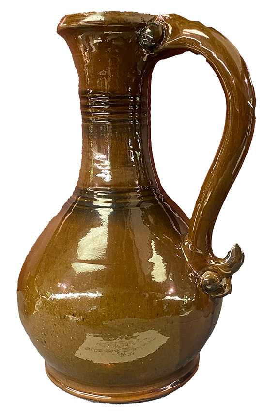 Ewer, made by I.S. Stahl August 26, 1941 on view at the Stahl's Museum
0 Comments
This summer I am working to formulate glazes and a clay body from the local clay dug from the Northampton Community College (NCC) East 40. https://www.ncceast40.org I’m weird; for me, waiting for the next glaze test to come out of the kiln is like a kid trying to wait to unwrap a present. But while I’m waiting for the tests that will come out of the kiln on Thursday, I thought I’d make a post about the preliminary testing I’ve already done. 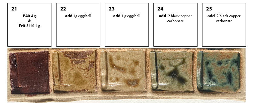 This is the last row of a 25 square (5x5) tile, which is why it starts with 21. Squares 1-19 were testing other ingredients outside of the scope of this post. See explanation below. Spoiler alert-I’m going to show you the best first, see above. To set this up, you have to realize that the clay at the East 40 is very rich with ingredients (probably iron, maybe manganese) that go very dark when fired to the high temperatures (roughly 2,380 degrees) we use for our glaze firings. I discovered a “magic powder” from my kitchen, that makes the East 40 clay fire light, and opens up striking color possibilities! I get eggs from a local farm, and if you’re familiar with truly free-range eggshells, you realize they are at least twice maybe three times as thick as factory farm eggshells. That's why eggshells build up fast at my house! Eggshells are on average 95% calcium carbonate, and calcium carbonate is one of the most common and useful ceramic ingredients. In glazes, calcium carbonate is usually sourced from whiting or talc. Eggshells, when fired, shrink in volume tremendously, which can cause problems in glazes. I did a preliminary bisque firing of my ground up eggshells, so that the shrinkage would happen BEFORE I put them in a glaze. You can see on the left in the line blend above, how dark the East 40 clay fires even though tis test was fired at a lower temperature than we use in the gas and wood kiln firings at the East 40. But wait! Add a little eggshell, (second from left square) and the color changes. Add a little more (center) and wow, a totally different glaze color, without adding any colorant!! But wait, there’s more. Add a little black copper oxide (colorant) and you get one green, a tiny bit more and you get a different green! I designed an entire 25 section biaxial tile-5 rows of squares by 5 rows of squares-investigating the interaction between 4 ingredients, as inspired by this line blend. All of the variations use the East 40 clay, and wood ash which is used as a flux (an ingredient to melt the clay into a shiny glaze). The balance of East 40 clay to wood ash is varied, explored both with and without the other two ingredients, the eggshells and the black copper oxide. Look for a post on when this tile comes out of the kiln! 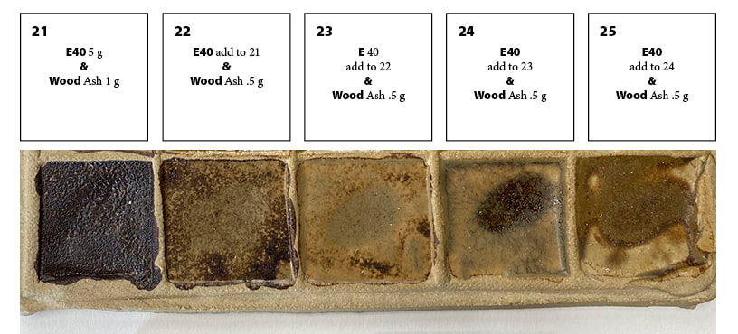 Like the tile above, this was the last row of a 25 section tile. Note that on the left, there is not enough wood ash to melt the clay enough to make a smooth and shiny glaze. Moving to the right, I'm adding a little more wood ash in each square. by tile 25 it loses the rocky texture of the first tile, getting closer to a usable glaze. Adding Wood Ash to East 40 Clay This test uses only two ingredients. Going left to right, I added increments of more wood ash to the East 40 clay. A few notes about this; for the ceramic artists out there, this was cone 6 oxidation. It's obvious that the 5 parts clay to one part ash is not nearly enough ash. (The ash is used as a flux, that is, to help melt the clay into a glaze.) I made impressions into each square with a finger, making a kind of "lake" within each square, and also applied the glaze unevenly to see how various thicknesses of the glaze would work. I'm working with such tiny amounts here that of course more testing is needed to nail down percentages, but it's pretty clear that the wood ash I was using, which was from the wood kiln at the East 40, needs to be over half the mix to melt the clay. I'm currently working on glazes for cone 10, so at that hotter temperature obviously everything will melt more than at this cone 6 (lower temperature) test. 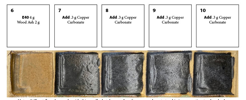 This too was part of a larger 25 section tile; this is one line, adding copper carbonate to a mix of East 40 clay and wood ash. Adding a colorant I wish I had done the line blend of just the clay and wood ash first! Here there isn't enough wood ash in the mix to start, and as you add a colorant like copper carbonate, that tends to retard melting and make matters worse. Note that even .3 grams is way too much colorant for a first step! Instead of green, which we would expect from copper carbonate, we're almost at black. That's why I start with simple line blends-I'm not using much in materials to get this kind of information that points me in the directions I should go. 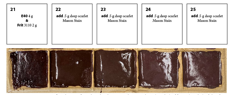 Another line blend that was the last row of a 25 section tile. Fired at cone 6 in oxidation. Above, I used 4 g of East 40 clay to 2 parts of a commercially produced flux, the same percentage of clay to wood ash from the last test. The commercial flux has a stronger action but even so, it's under-melted. I'm using a commercial mason stain for the colorant. The main problem is that the clay when properly melted into a glaze is so inherently dark, it's hard to notice much color difference from the base glaze at left with no colorant. 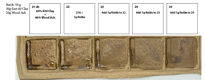 Again, a line blend that is the last row of a larger 25 section tile. Fired at cone 6 in oxidation. In the basic mix at left before I started adding rutile, it's melting ok but not great. Rutile can add color, texture and odd what I'll just call variations to the look of a glaze. Like the cobalt carbonate, it also makes the glaze more matte, or under-melted, under vitrified in ceramic terminology. Matte glazes are a thing, we don't always want super glossy glazes, but they can be more prone to leaching and other defects/weaknesses. I do want to do more tests with rutile going forward, just that every time I add an increment of rutile I know I need to add an increment of flux (melter) at the same time.
The way-back story I first used this clay when I was working on my master’s thesis, using a simple mix of half East 40 clay and half of a commercially available clay to make loom weights. (See crossing in my portfolio section) In my summer of 2022 Residency at the East 40, I used the clay, raw and roasted in a bonfire, as pigments for paints that I made and used in the “Imaginary Landscape” series of paintings that were featured in my Fall 2022 solo exhibition. During the residency, Walter Heath saw me grinding up rocks for pigments, and immediately had visions of using them to develop glazes. That summer I wasn’t ready to go there-but in 2023 I began preliminary testing, not just for the East 40 clay, but from local rocks I had picked up and processed. In this post I’m only showing the initial line blends I did with the East 40 clay, omitting all the rock glaze tests and tests on clay I dug out of my front yard-it’s a long enough post as is! 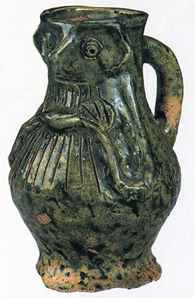 Pichet glaçuré anthropomorphe, Angleterre, v. 1300. Londres, The Trustees of the British Museum, inv. MLA 55, 10-29.11 There is something about the weirdness, and richness of Medieval Art that has been an inspiration to me ever since I can remember. But just in this past year, I came across a Medieval wine pitcher (see photo above) that pitched me into a new series of work in ceramics. I love that this guy’s hands are circles with lines through them, and his arms a simple single string of clay. I love that we still see them as hands and arms; I could give many more examples on this and other pieces but the point is, it’s this leap of imagination that intrigues me. Bestiaries are another related concept in medieval art that inspires me, how species could be mixed and matched, and become a new creature such as a griffin. And finally, I have always loved the flat out decoration of Medieval and Gothic things, from buildings to furniture to textiles etc. What fascinates me about the Medieval decoration is how a very few simple geometic forms can become incredibly rich and varied with repetition. These three medieval inspirations-weird abstraction, mixing of species and repetitive ornament-became the basis for a whole series of work in ceramics. 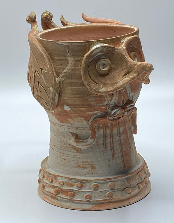 Owl guy-2024, white stoneware with white salt glaze, woodfired, approx 7.5" tall 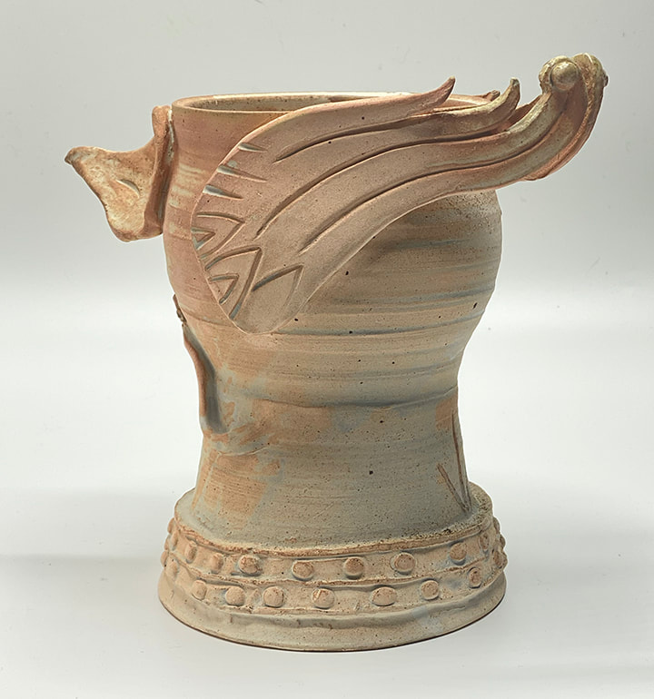 side/back view of Owl guy-2024, white stoneware with white salt glaze, woodfired, approx 7.5" tall 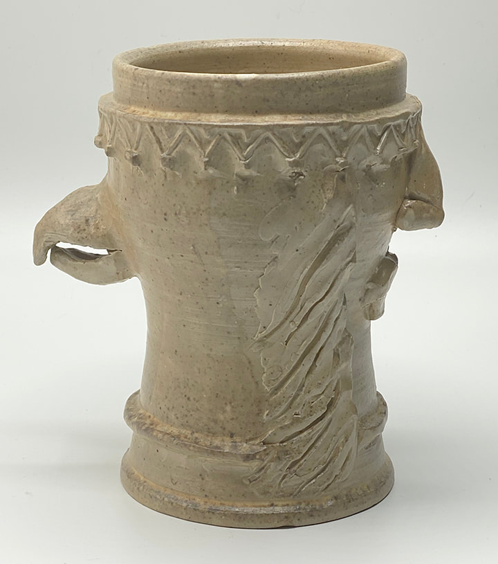 Eagle Guy-2024, white stoneware with white salt glaze, woodfired, approx 7" tall 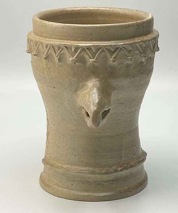 Eagle Guy-2024, white stoneware with white salt glaze, woodfired, approx 7" tall 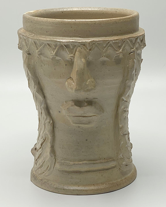 Eagle Guy-2024, white stoneware with white salt glaze, woodfired, approx 7" tall I was so busy telling the story of firing the old wood kiln in part 1, I didn't include all the photos I had picked to go along with it! For more information of what these are about, ready part 1 from December 2, 2022. 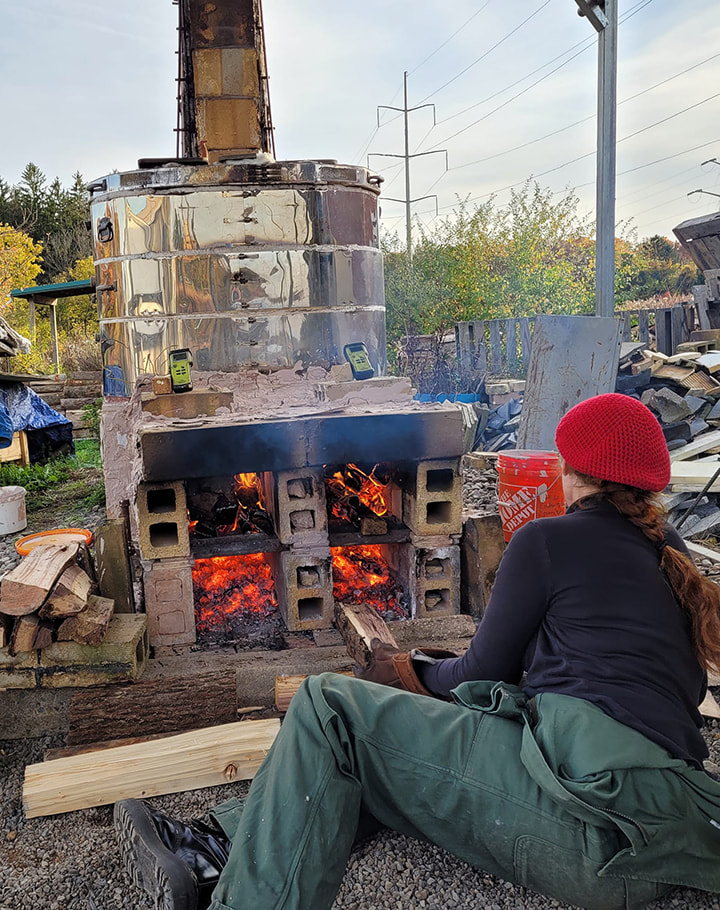 Here I am stoking the kiln early in the day. 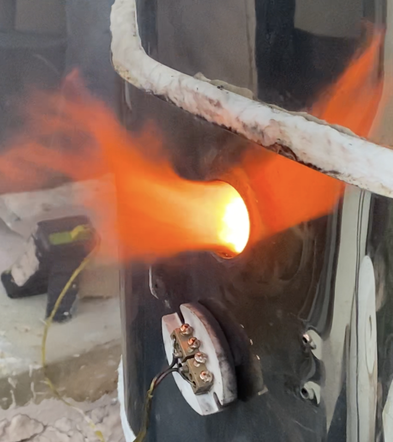 You can tell a kiln is in reduction if you pull the plug from one of the peep holes, and flame comes shooting out like this! The fire is starved for oxygen, so it's reaching out through the peephole to get it. 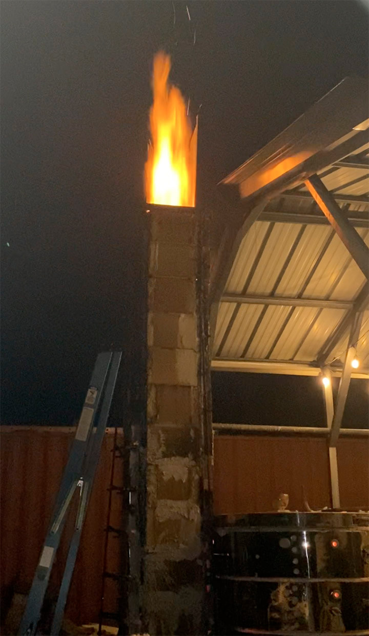 If you have this much fire shooting out the chimney, you are in HEAVY reduction. 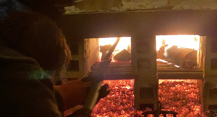 Dave Graham doing his spear and raking magic to keep logs from clogging up the passage to the ware chamber above 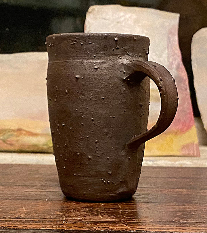 In part 1 this was still wet on the wheel. Here it is fully fired. None of the other pots had protrusions like this one. I think that's because I had put woad inside, and we capped it with aluminum foil so that the woad vapors would stay inside. Something about that made whatever impurities were in the clay kind of pop out. This was the A body garden gold you saw me mixing in part 1 of this post. 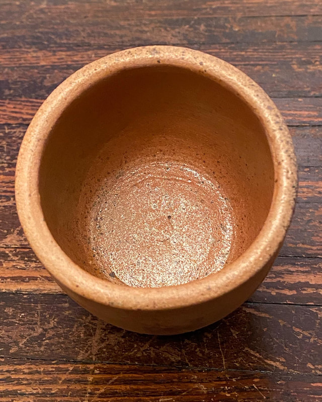 The shine you see on this is entirely from wood ash deposit, it was not glazed. 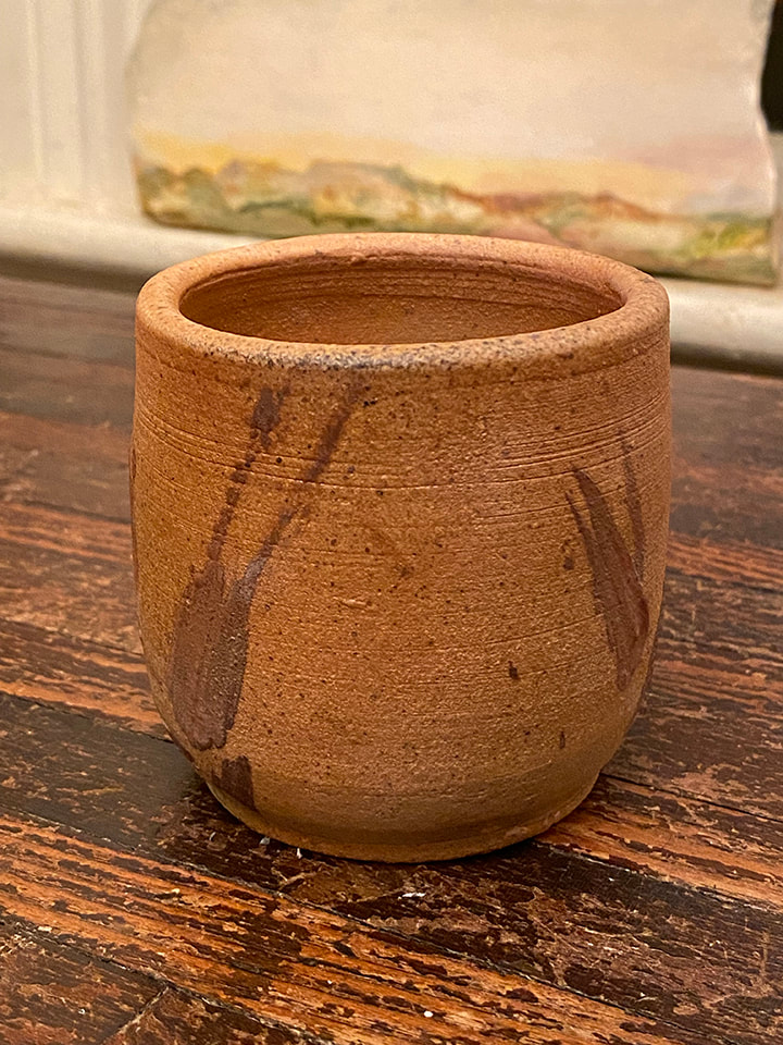 This is the outside view of the cup above. I used 100% garden gold clay (dug from the East 40) using a brush I made from grasses at the East 40 to make the bush marks on the side. This was a commercial 119 clay body. I had made this for a demo before making the A and B body clays from the East 40 "garden gold." 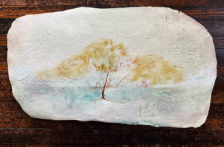 Imaginary Landscape #6, 9" x 16", handmade oil on clay, 2022. This was the first to be finished, even though it was the sixth painting on clay panel that I started. The primitive and labor-intensive processes of growing dye plants, making natural dye, making pigments including from the natural dye, making paints from the pigments and making clay structures to paint them on took up the bulk of this summer’s residency. Now I’m finally using all those materials! Around August first, I started using only oil paint I had made in the residency on the clay slabs, and then tried out the watercolor to tint a pencil drawing I had made of something (I’m not sure what kind of plant it is) growing in the community garden. 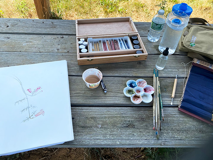 I call this photo "to be continued" because without a white or a brighter yellow, I couldn't get where I wanted to go with tinting this little pencil sketch. I'll just have to finish this when I can make the missing colors! After only 3 days of painting, it was pretty clear what was missing; a true brighter, lighter yellow and a more opaque white. Throughout history, from cave painting onwards, many artists have done amazing work with very restricted palettes such as brown, black and white. The most restrained color palettes, especially monochrome, nearly always use white. Problem is, modern artist paints generally use metals for white. Historically and to this day lead white was used, now mostly titanium and some zinc are used for white. The processes to make the metal paints are just not something I’m NOT going to get into, because of how involved they are, the equipment needed and how potentially toxic it can be. I first tried chalk from champagne, France-a natural white material I had on hand because it was used in the pastel and gouache paints I made. I quickly learned why chalk is used to make pastel and gouache-it’s almost transparent. If you add chalk to a paint or pastel, it changes the texture and working properties, but what you see is not so much the chalk but whatever the pigment’s color-blue, red, yellow etc. The chalk just wasn’t opaque enough. Making my own set of paints, and using them, has given me an appreciation of what is essential and what isn’t. I'm using far fewer colors, and it's frankly pretty interesting how far these few homemade paints can go. I plan to solve the white dilemma with white clay for white. I know white clay used to be mined from this area, and hopefully I’ll eventually be able to find some local white clay. With the residency over and fall classes almost here, I’m going to cry uncle and “cheat” with some commercially made white until I can make a white from clay. When it comes to the true yellow, I’m confident I can do this myself with natural, local materials. I have some dried weld that Marla grew for me in her dye garden, and weld is one of those dye plants that was historically used to make lake pigments. I’ve made lake pigments before, and I’m hoping to just make do with the garden gold until I can make pigment from the weld. At this point I haven’t cheated and used any commercially made yellow paint. 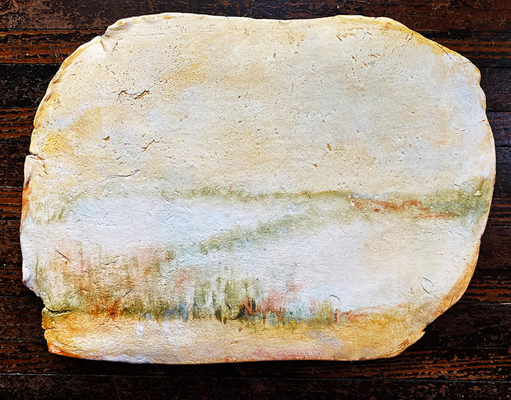 Imaginary Landscape #5, 10" x 13.5", handmade oil on clay panel, 2022. I find it kind of funny that the clay I used was a white stoneware, and what looks like the color of a yellow brown clay is an oil paint I made from the clay dug from the East 40. Kind of funny painting clay onto clay. I’m really enjoying exploring the imaginary landscape idea with my homemade natural paints on the clay slabs. I work on a bunch at a time, working on each a little each day, building up the colors. I do of course mix the colors, but I also use layers of translucent paint, where one layer is dry before I add the next layer. The layers are thin so I don’t lose the texture and properties of the clay slabs. The weight of the clay, the physicality is important. They are not images on a “blank” white picture plane. I’m not trying to illustrate a landscape, but to allude to one.
It’s hard to know when these paintings are “done.” I put two in the ESU faculty show that are so minimal that it was hard for me to accept they were finished. The show opens the first day of the semester, August 29, at the Dunning Gallery on NCC’s Monroe campus. There are paintings in progress in my studio that already have much more paint on them than the two in the show, but they are not “done” yet because to me they just aren’t doing everything they need to do as a painting. When a painting gets to a point where it doesn’t need anything-where if you did anything more it would make it worse-it’s done. The art is figuring out when you are at that point! |
Cindy VojnovicArtist & Educator Archives
September 2025
Categories
All
|
 RSS Feed